Colour isn’t just decoration. In UI/UX design, it’s a powerful psychological tool that guides decisions, triggers emotions, and shapes how users interact with your digital product.
From red “Buy Now” buttons to calming blue backgrounds, colour choices can make the difference between a click and a bounce.
In this guide, we explore the psychology of colour in UI/UX design and how your business can use it to build trust, boost conversions, and create engaging experiences.
Why Colour Psychology Matters in Design
Colour influences:
- First impressions: Users form opinions within 50 milliseconds
- Brand perception: Colours trigger specific emotional responses
- User journey: Colours guide users toward actions (CTAs, menus, etc.)
When done right, colour can:
- Encourage clicks
- Improve readability
- Enhance brand recall
- Reduce bounce rates
When done wrong, it can confuse users or even push them away.
Common Colours and Their Psychological Effects
Here’s how common colours are perceived in UI/UX design:
| Colour | Emotional Response | Best For |
|---|---|---|
| Red | Urgency, Excitement | CTAs, sales, alerts |
| Blue | Trust, Calm, Security | Finance, tech, healthcare |
| Green | Growth, Peace, Balance | Environment, wellness, success messages |
| Yellow | Optimism, Energy | Highlights, attention-grabbing elements |
| Black | Luxury, Sophistication | Premium brands, minimal UI |
| White | Simplicity, Cleanliness | Backgrounds, modern interfaces |
| Purple | Creativity, Royalty | Beauty, design, luxury tech |
Tip: Always consider cultural meanings; colours like white or red may symbolise very different things in different regions.
How Colour Influences User Behaviour in UX
1. Call-to-Action (CTA) Effectiveness
The colour of buttons can directly impact click-through rates.
Example:
- Red creates urgency
- Green feels natural and positive
- Blue builds trust
Use contrasting colours for CTAs so they stand out from the rest of the interface.
2. Visual Hierarchy & Focus
Colour guides attention. Highlighting important areas with bold or contrasting colours helps users navigate quickly and intuitively.
Example: A muted interface with a bright CTA draws immediate focus to the action you want users to take.
3. Emotional Connection
Colour sets the tone of your app or website.
- Blues can make a financial app feel secure.
- Yellows make e-learning feel friendly and approachable.
- Dark themes create mystery or exclusivity in gaming and luxury brands.
The right emotional tone increases time-on-site and improves brand perception.
4. Accessibility & Readability
Using poor contrast or relying solely on colour to convey meaning can frustrate users—especially those with visual impairments.
Use tools like WebAIM Contrast Checker to ensure your colour choices support accessibility.
Real-World Application: UI/UX in Action
Let’s say you’re designing a wellness app. A soothing palette of greens and whites can:
- Encourage calmness and relaxation
- Build trust for sensitive features like mood tracking or journaling.
- Support long-term engagement with a positive user environment.
In contrast, a high-energy fitness app might go for bold oranges and reds to convey urgency and motivation.
Best Practices for Using Colour in UI/UX Design
- Use your brand colours consistently across platforms
- Create colour palettes for primary, secondary, and accent uses
- Test colour choices in real devices and lighting conditions
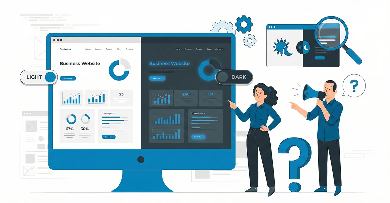
- Consider dark mode variations for mobile apps.
- Use colour to complement content, not distract from it
You may like to read this:
10 Proven Strategies to Effectively Utilize LinkedIn Marketing
FAQs
1. What is colour psychology in UI/UX?
Colour psychology is the study of how colours influence user emotions and behaviour. In UI/UX, it’s used to guide actions and create desired moods.
2. What colours are best for call-to-action buttons?
Colours like red, green, and orange are commonly used. The key is to contrast the CTA with the rest of the page to make it stand out.
3. Does colour impact conversion rates?
Yes. Tests have shown that simply changing the colour of a CTA button can significantly increase click-through or conversion rates.
4. How can I test which colours work best?
Use A/B testing tools to compare different colour schemes and analyse user interactions and performance metrics.
5. Is colour perception the same across all cultures?
No. Cultural differences can impact how colours are perceived. Always research your audience’s preferences and associations.
Final Thoughts
Colour is more than aesthetics—it’s a functional part of your UX strategy. When used intentionally, it can help users feel at ease, take action, and remember your brand.
Whether you’re building a website, mobile app, or SaaS dashboard, understanding the psychology of colours gives you a design edge that connects emotionally and performs effectively.